
What migration patterns can tell us—and which questions a movement chart cannot answer. Migration can refer to a change in usual residence, a seasonal journey or a daily commute. These are distinct experiences. Begin by checking which definition a dataset uses.
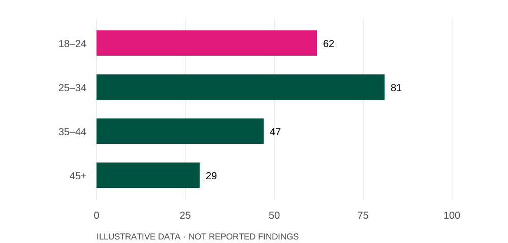
In this illustrative series,
81is the highest value, for 25–34.
In this illustrative series,
29is the lowest value, for 45+.
Source: illustrative prototype dataset. Illustrative index; not survey findings.
What counts as migration?
Migration can refer to a change in usual residence, a seasonal journey or a daily commute. These are distinct experiences. Begin by checking which definition a dataset uses.
Movement across illustrative age groups
Illustrative index; not survey findings
Source: Illustrative prototype dataset
How does age change the picture?
Comparing age groups can reveal patterns hidden in an overall total. But group size matters: more movers in one age band does not necessarily mean a higher likelihood of moving. Rates and counts need to be read together.
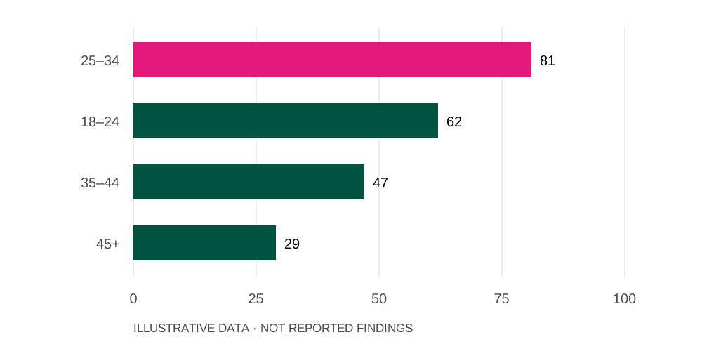
The same values, ordered from highest to lowest
Illustrative index; not survey findings
Source: Illustrative prototype dataset
What sits behind the movement?
A chart can identify a pattern without explaining it completely. Interviews and carefully designed surveys can help explore how education, work and family decisions sit behind the movement.