
A national total can hide a remarkably concentrated geography. Here is how to look beyond it. Imagine a crop whose production is concentrated in a few places. A single national total tells us how much was produced, but says little about where that output comes from. Breaking the total into regional shares makes that concentration visible.
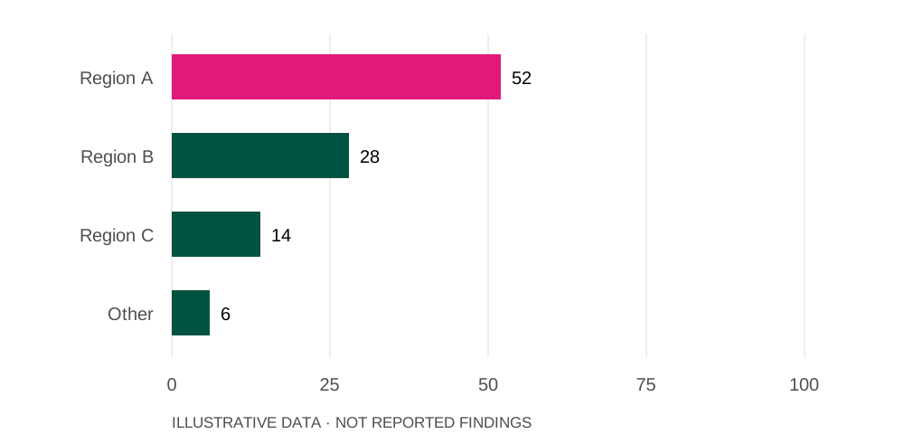
In this illustrative series,
52%is the highest value, for Region A.
In this illustrative series,
6%is the lowest value, for Other.
Source: illustrative prototype dataset. Illustrative share (%).
What does the regional pattern show?
Imagine a crop whose production is concentrated in a few places. A single national total tells us how much was produced, but says little about where that output comes from. Breaking the total into regional shares makes that concentration visible.
A crop, unevenly distributed
Illustrative share (%)
Source: Illustrative prototype dataset
How should we compare growing regions?
Output, area under cultivation and yield answer different questions. A region can produce more because it has more planted land, because each hectare produces more, or both. A useful comparison keeps these measures separate.
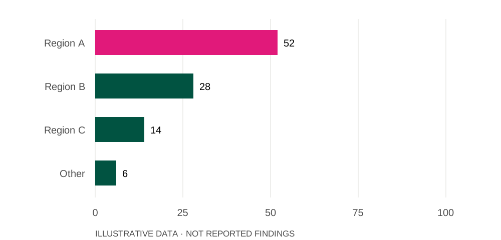
The same values, ordered from highest to lowest
Illustrative share (%)
Source: Illustrative prototype dataset
What else shapes the harvest?
Weather, crop variety and the reporting period matter when comparing harvests. Before drawing a conclusion, check whether the figures refer to the same season and whether they are estimates or final totals.