
Capacity and generation tell different stories. Understanding the distinction changes how we read the energy transition. A share needs a clearly defined total. Installed capacity measures the rated output of a set of generators. Electricity generation measures the energy actually produced over time. The two are related, but they are not interchangeable.
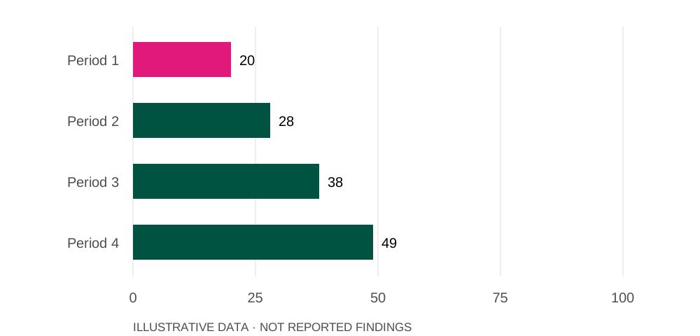
In this illustrative series,
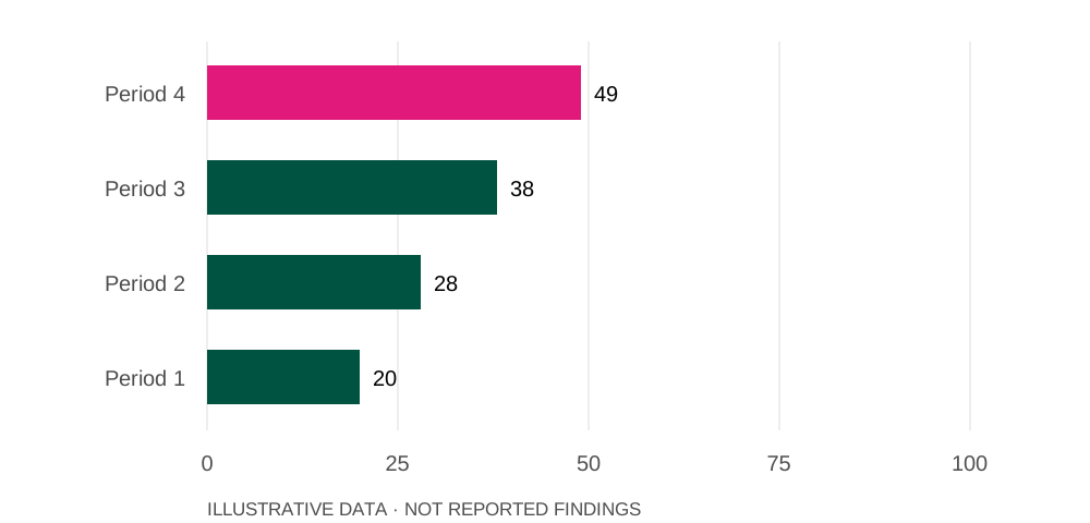
49%is the highest value, for Period 4.
In this illustrative series,
20%is the lowest value, for Period 1.
Source: illustrative prototype dataset. Illustrative non-fossil share (%).
What does a capacity share measure?
A share needs a clearly defined total. Installed capacity measures the rated output of a set of generators. Electricity generation measures the energy actually produced over time. The two are related, but they are not interchangeable.
A changing share of capacity
Illustrative non-fossil share (%)
Source: Illustrative prototype dataset
How does timing change the picture?
Two sources with similar installed capacity can produce different amounts of electricity. Availability, operating conditions and the time of day all influence what reaches the grid. A capacity chart does not show those differences.
The same values, ordered from highest to lowest
Illustrative non-fossil share (%)
Source: Illustrative prototype dataset
What else should we look at?
To understand how the system is changing, pair the capacity mix with generation, demand and transmission information. Each adds context to a headline share that would otherwise be easy to overinterpret.